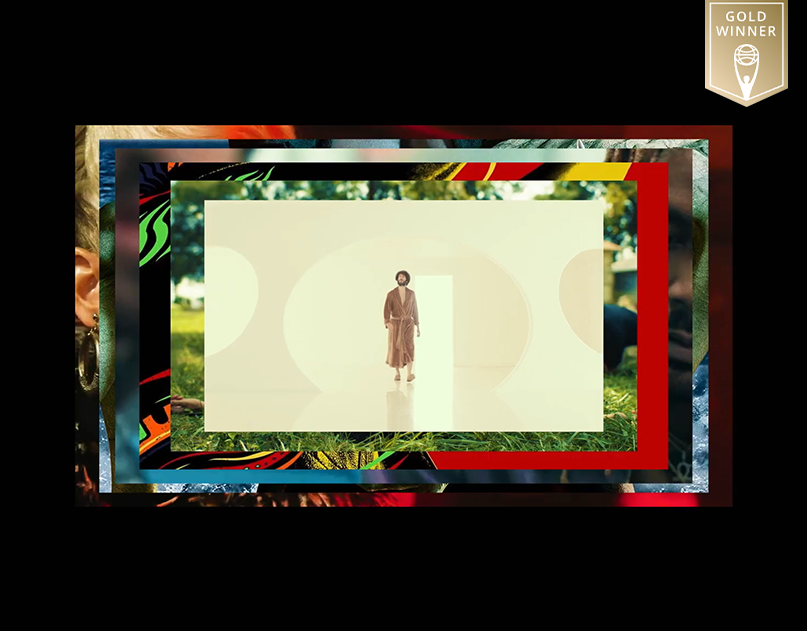
The following is a look at my unused art direction for the Superman social campaign that I decided to title "Excellence."
"Excellence" is not just about Superman’s power; it’s about his untouchable legend. It is the embodiment of aspiration, an aesthetic that presents him as the ultimate ideal—unchallenged, unwavering, and eternal.
"Excellence" is not just about Superman’s power; it’s about his untouchable legend. It is the embodiment of aspiration, an aesthetic that presents him as the ultimate ideal—unchallenged, unwavering, and eternal.
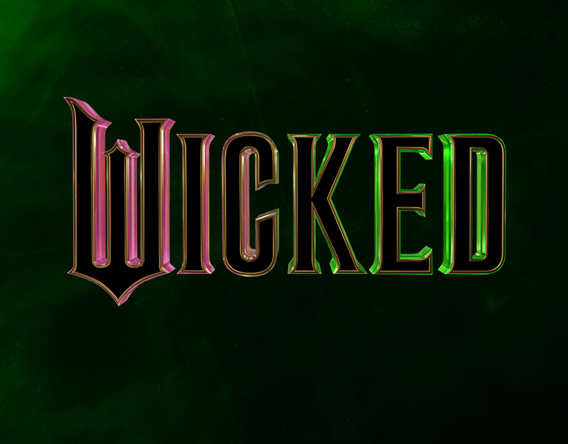
The typography of this direction reflects strength, clarity, and prestige. Letterforms are bold yet refined, with sharp serifs and subtle beveling that evoke a sense of timeless heroism. Gold-foil embossing and metallic gradients enhance the regal aesthetic, while kerning remains tight for a compact, powerful presence.
The design emphasizes striking imagery of emotion and action—expressive close-ups, powerful stances, and kinetic motion that capture Superman’s unwavering resolve and the energy of his world.
Although this first direction wasn't picked, it was still a super fun exploration and it allowed me to try designing an aesthetic that I don't usually do.


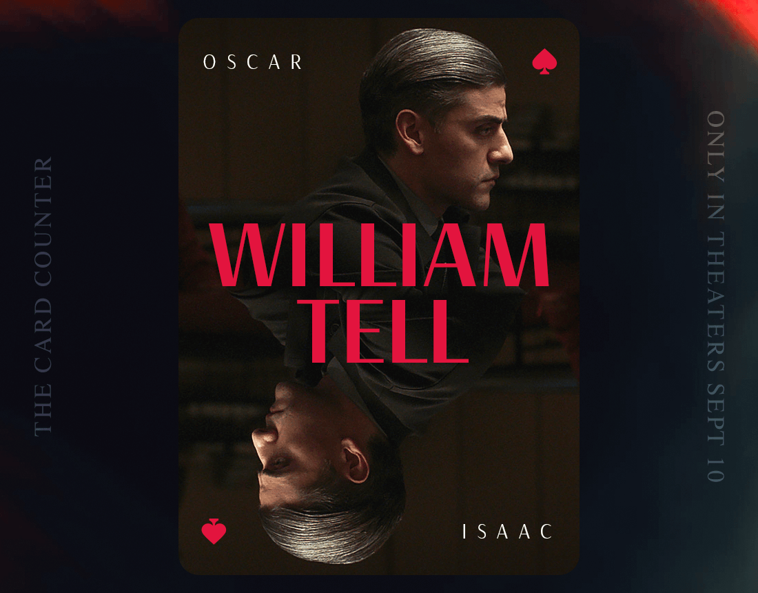
In addition to the overall look & feel, I wanted to take a stab at designing some character intro posters. I envisioned these being brought to life later by animating a core element that related to each character. For example, Mr. Terrific's T-Spheres or papers falling around Lois Lane at The Daily Planet.
