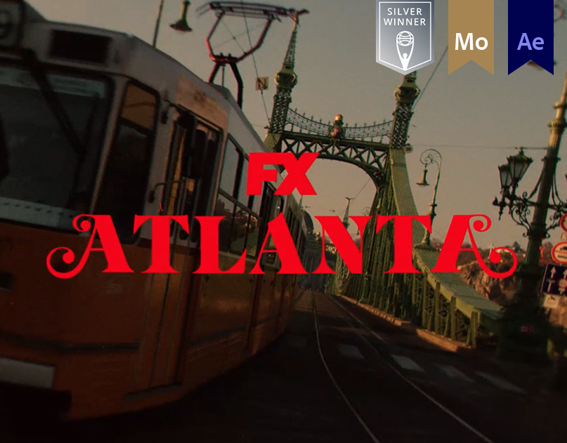
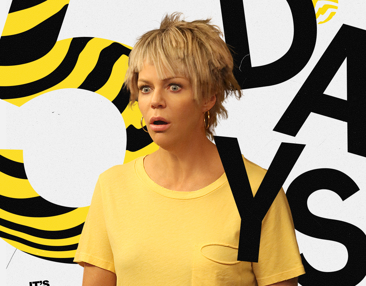
For our exploration of Season 4, we wanted to let viewers know that this time around, we are back home… in Atlanta. And since we’re back home, we wanted to pay homage to the aesthetic of the first two seasons, while putting a fresh new spin on it.
This idea that Atlanta has all been a dream, was another driving force behind our approach for the overall animation styles and aesthetic for our Season 4 exploration. This vision– paired with selected music and sound design–has started to create a surreal Atlanta fever dream atmosphere that can be used throughout the package.
Below are some unused motion explorations for Atlanta season 4. Although these directions didn't go through to finish, they helped us hone in on the final direction–which ultimately followed what we had done for season 3 motion package.
Lost but not forgotten.
Lost but not forgotten.
Direction 1 - Airhead
–
Whatever happened to Airheads?
Well, we’re paying a bit of homage to them in this one. Pushing on a version of surrealism, this quick type animation grabs the viewer's attention while providing a strong form of hierarchy. Just as the air of a balloon quickly escapes when released from your fingers, the footage too is being played at a rapid pace. The quick speed ramps allow us to highlight the rack focus motif, and ultimately accentuate the underlying dream sequence.
Well, we’re paying a bit of homage to them in this one. Pushing on a version of surrealism, this quick type animation grabs the viewer's attention while providing a strong form of hierarchy. Just as the air of a balloon quickly escapes when released from your fingers, the footage too is being played at a rapid pace. The quick speed ramps allow us to highlight the rack focus motif, and ultimately accentuate the underlying dream sequence.
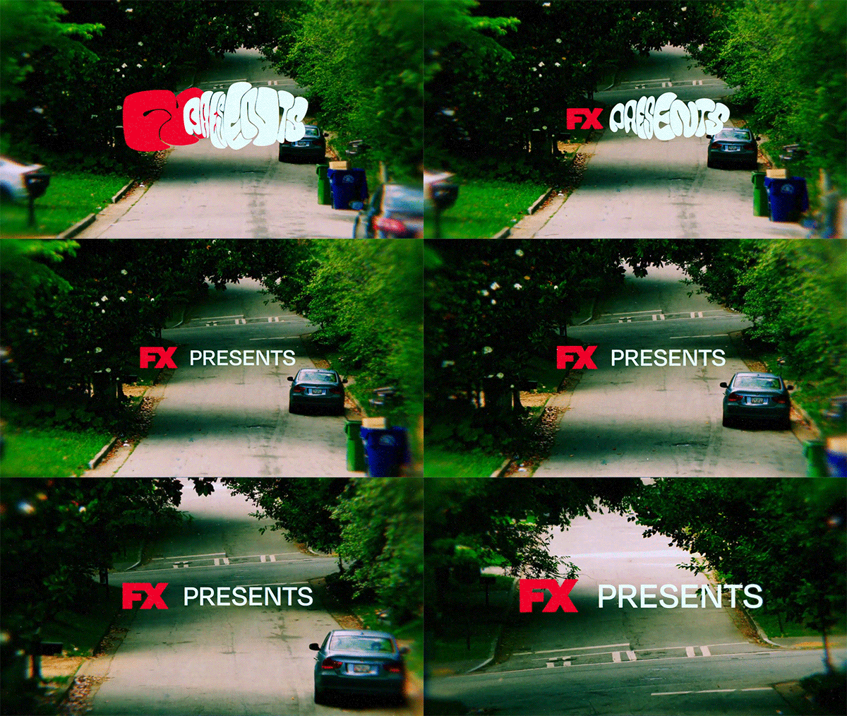
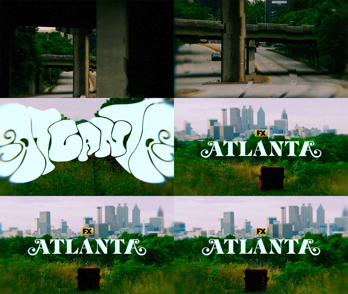
Initial Style Frames
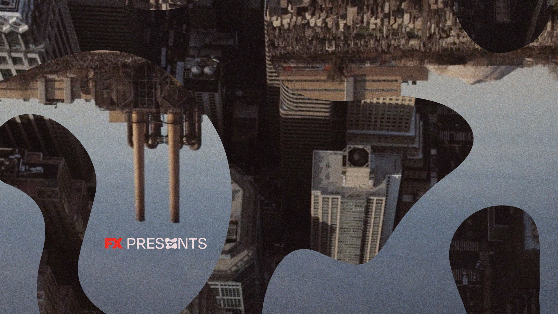
Direction 2 - Trippy Red
–
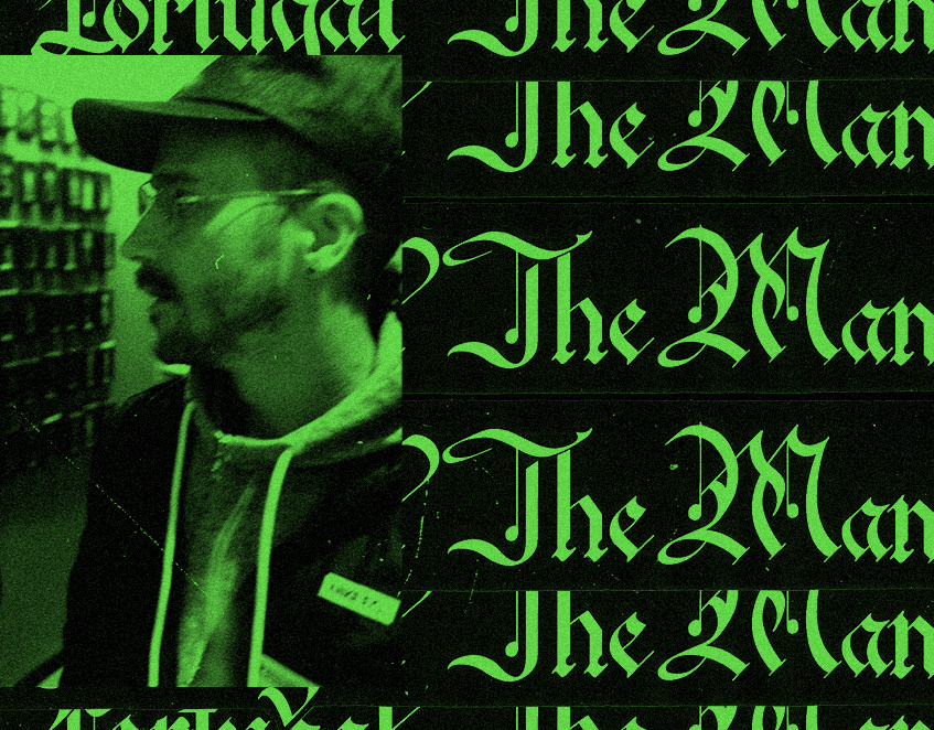
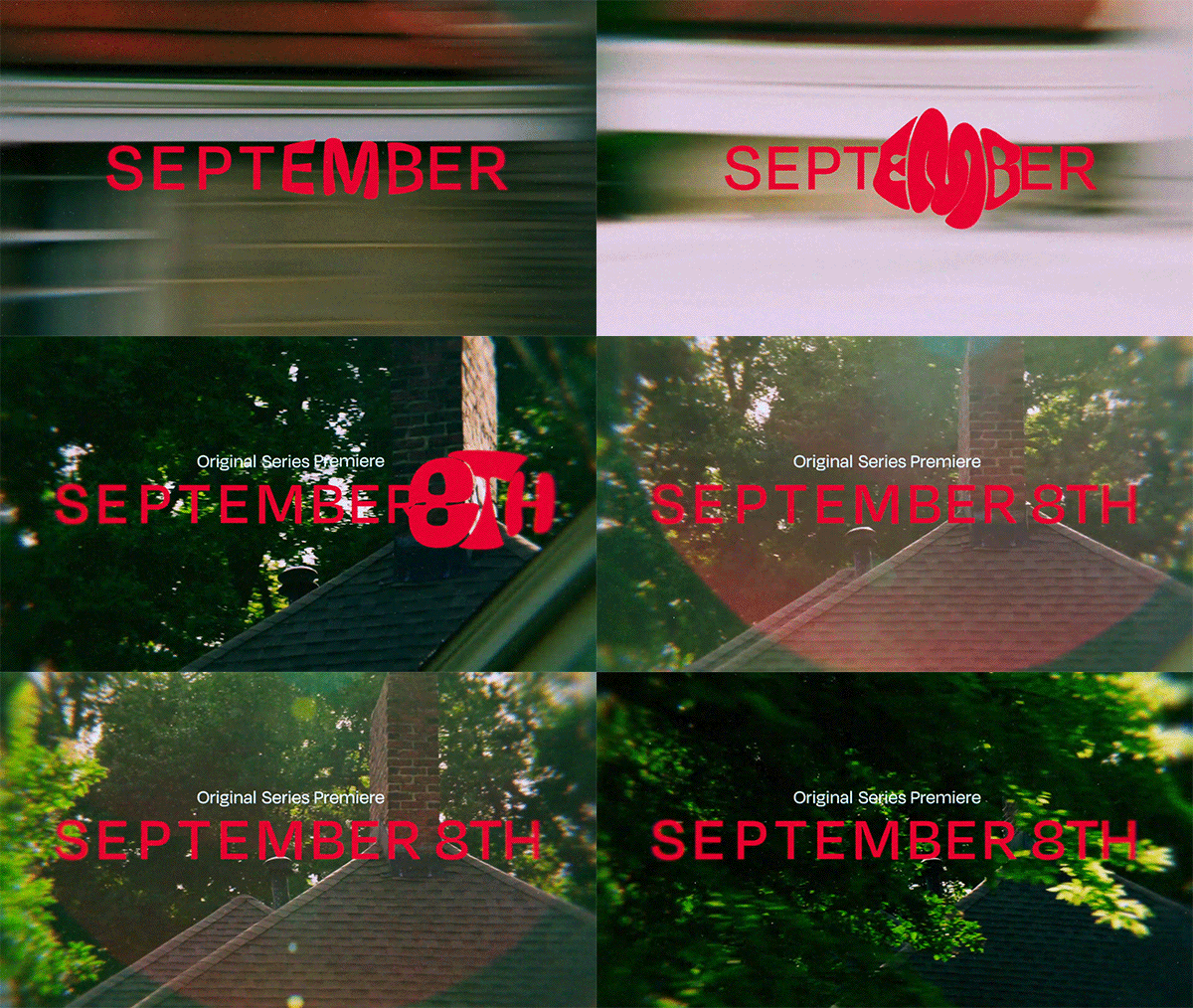
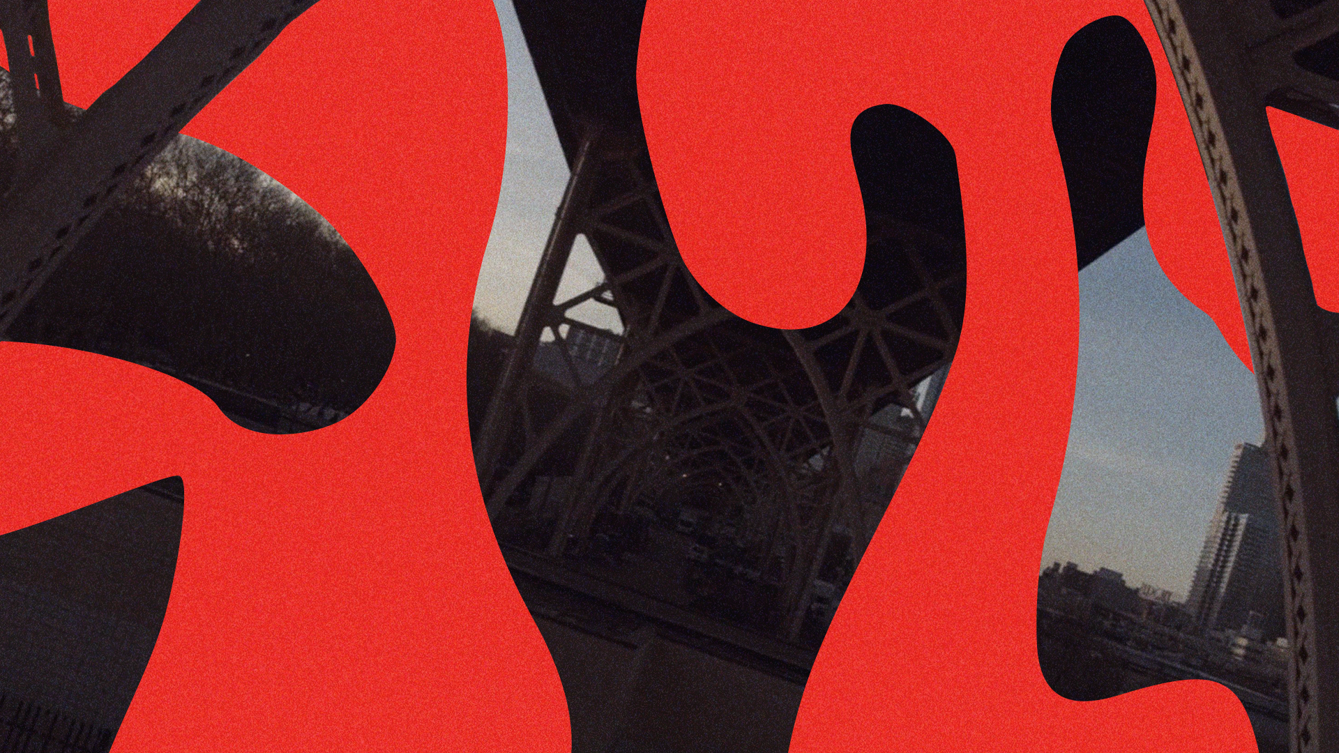
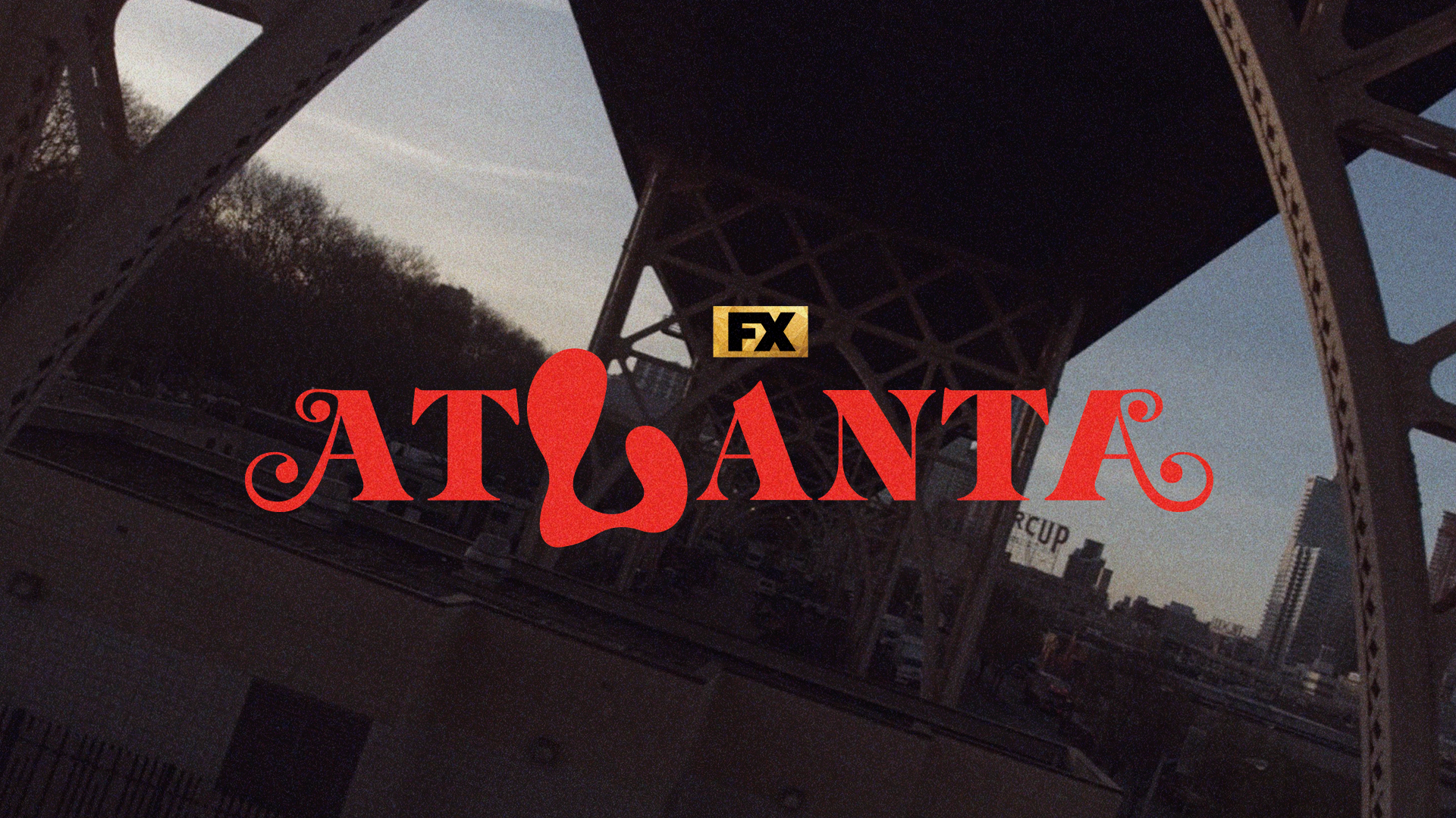
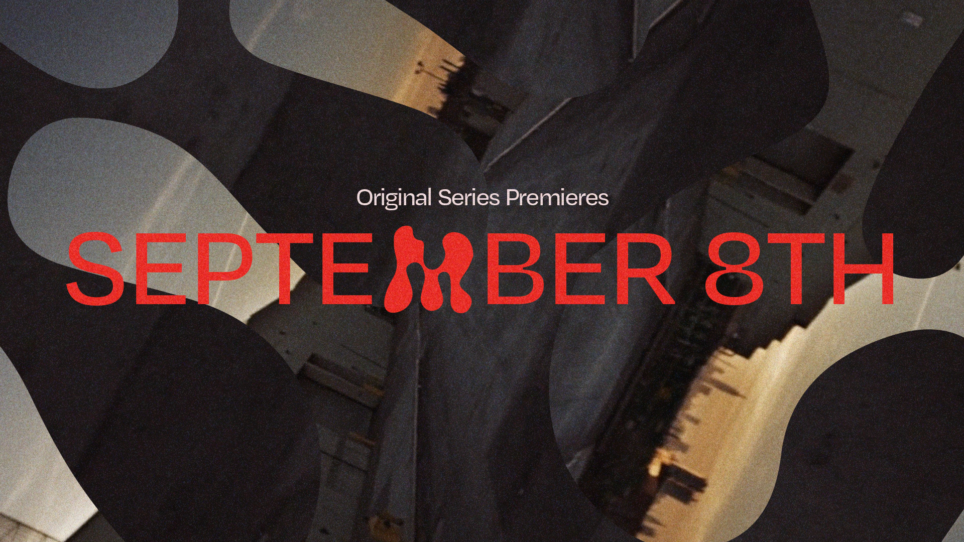
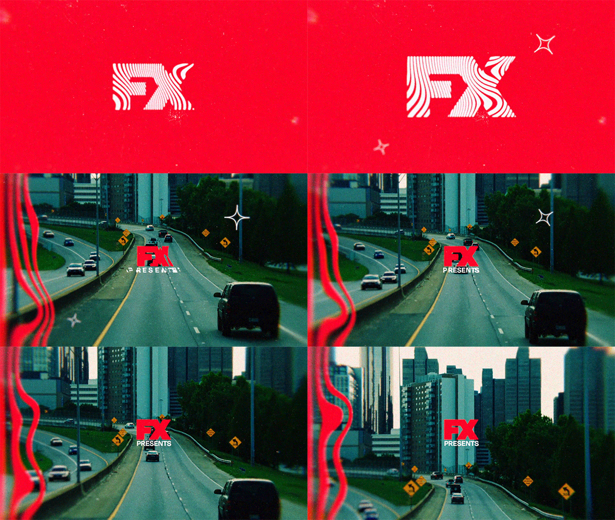
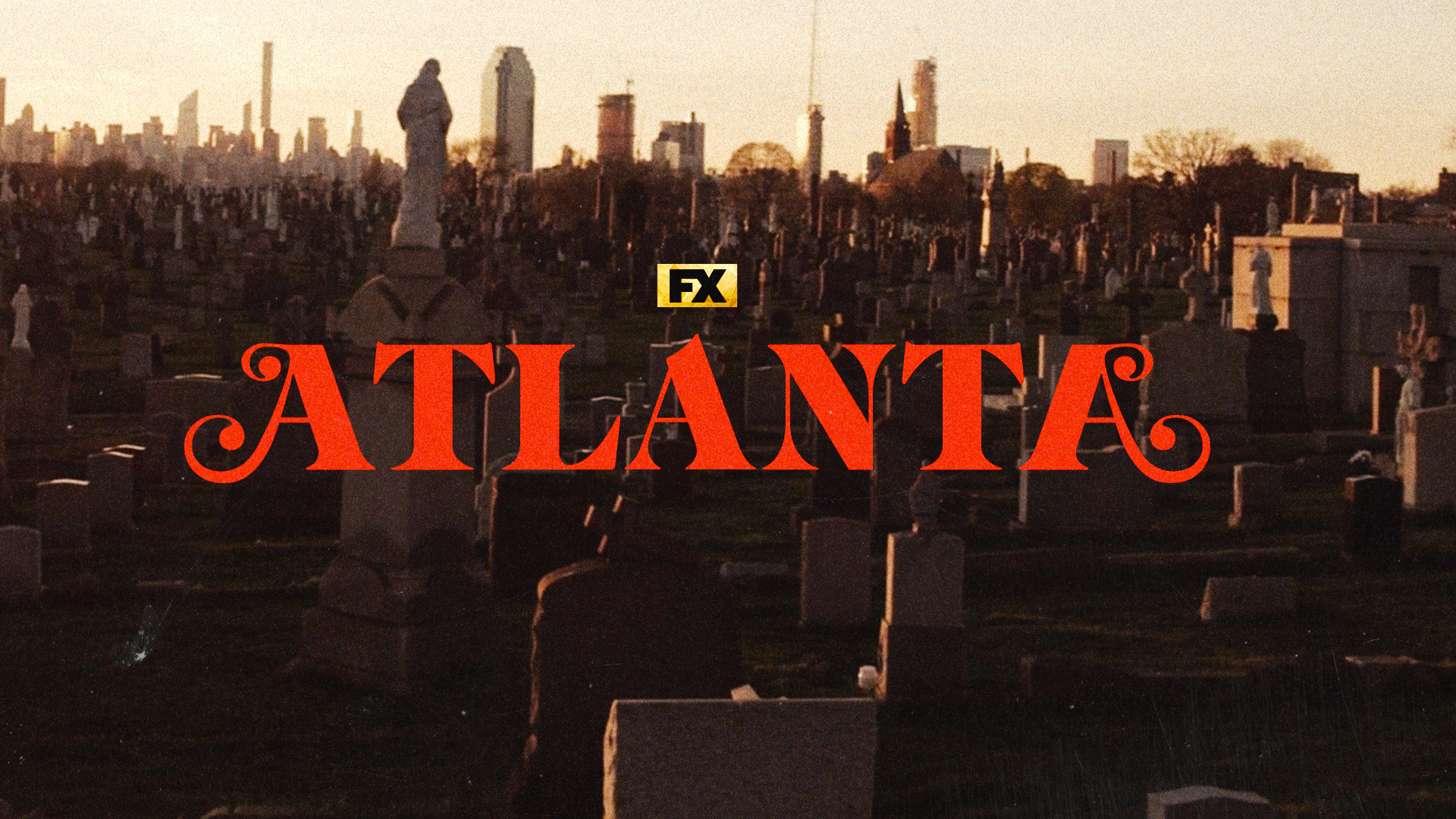
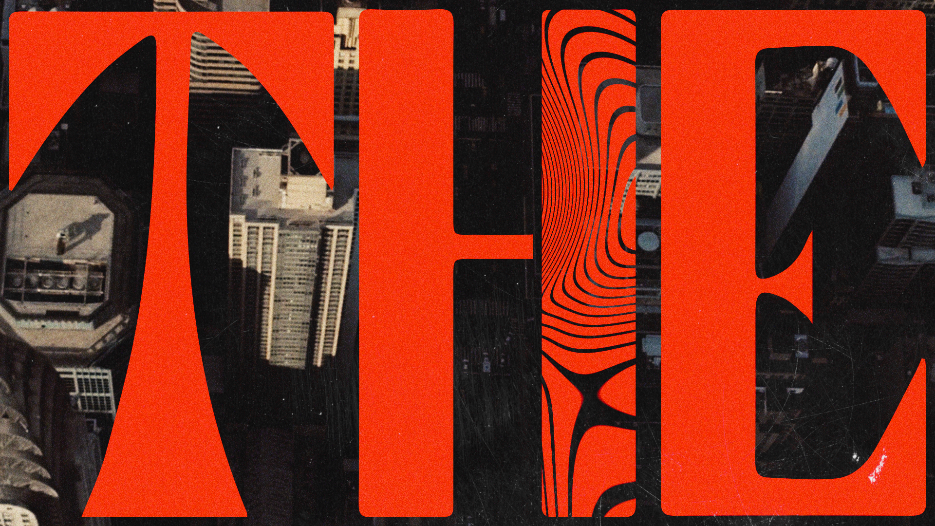
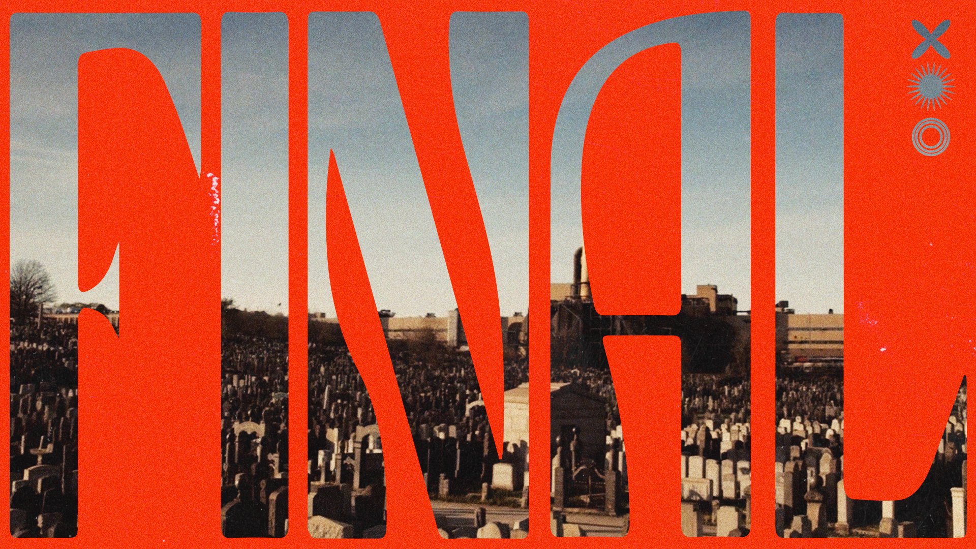
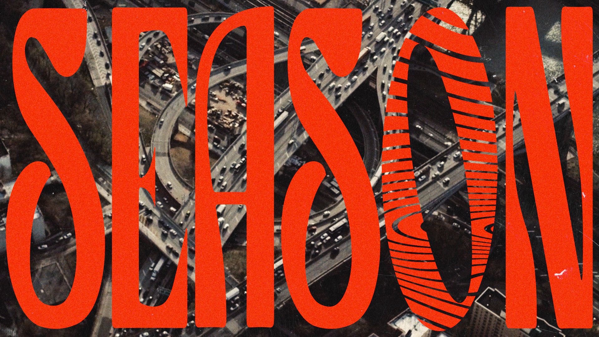
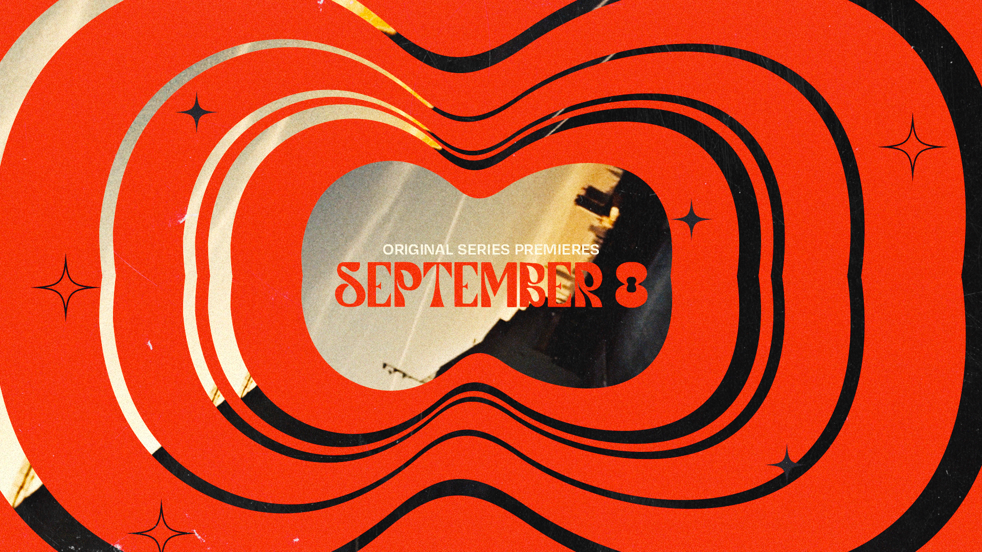
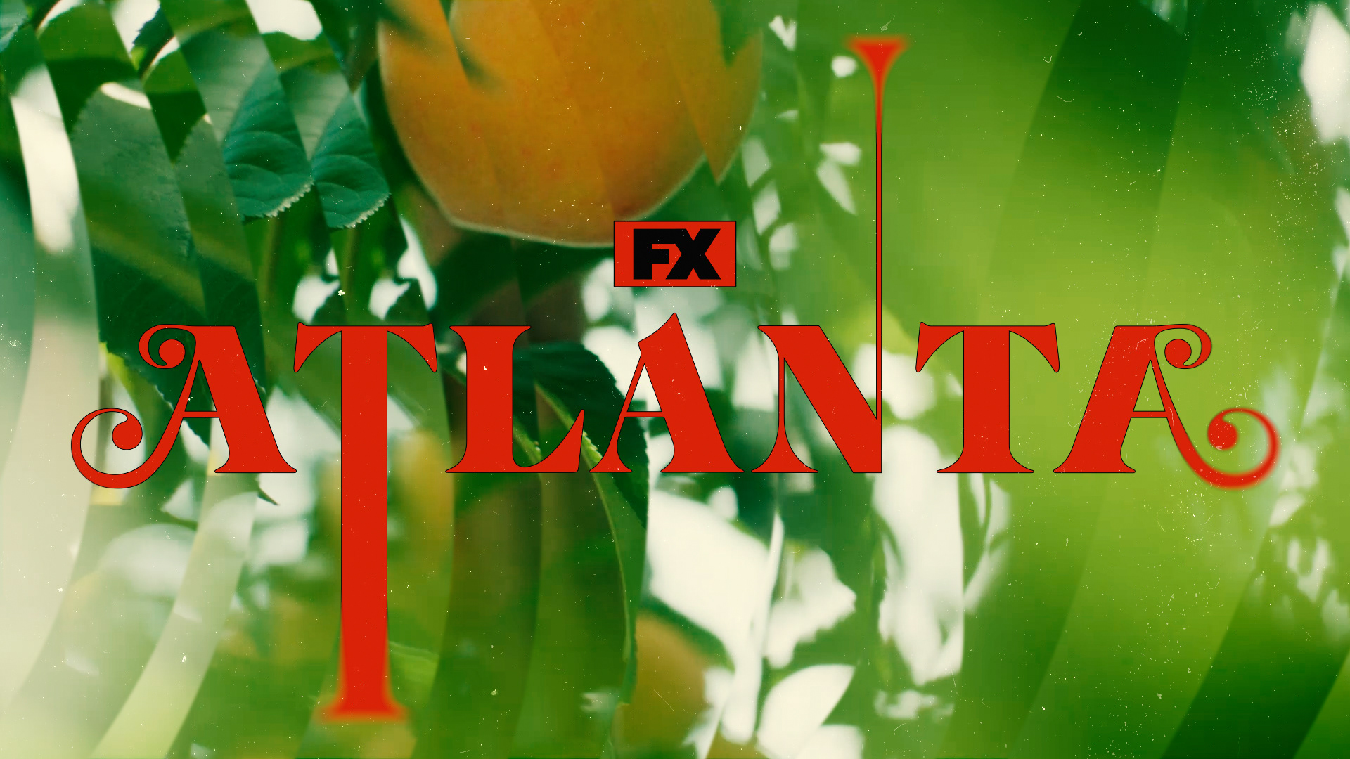
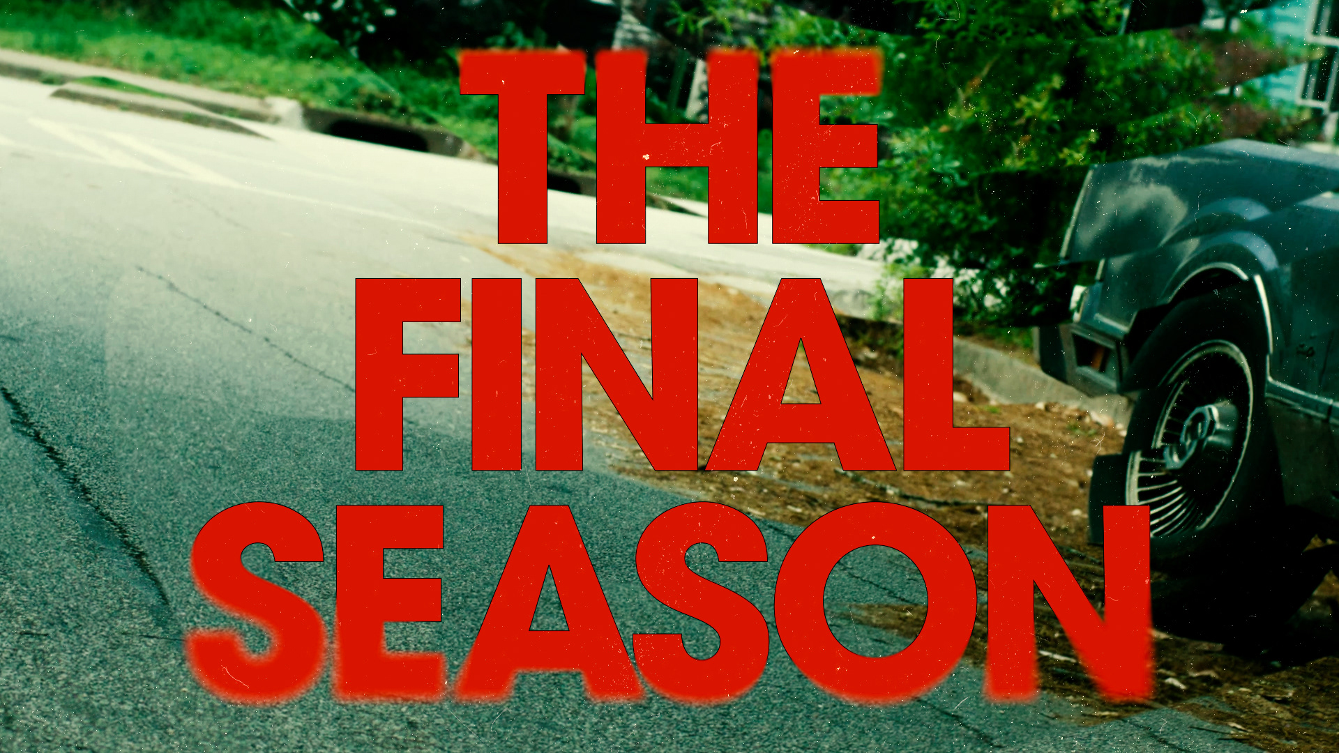
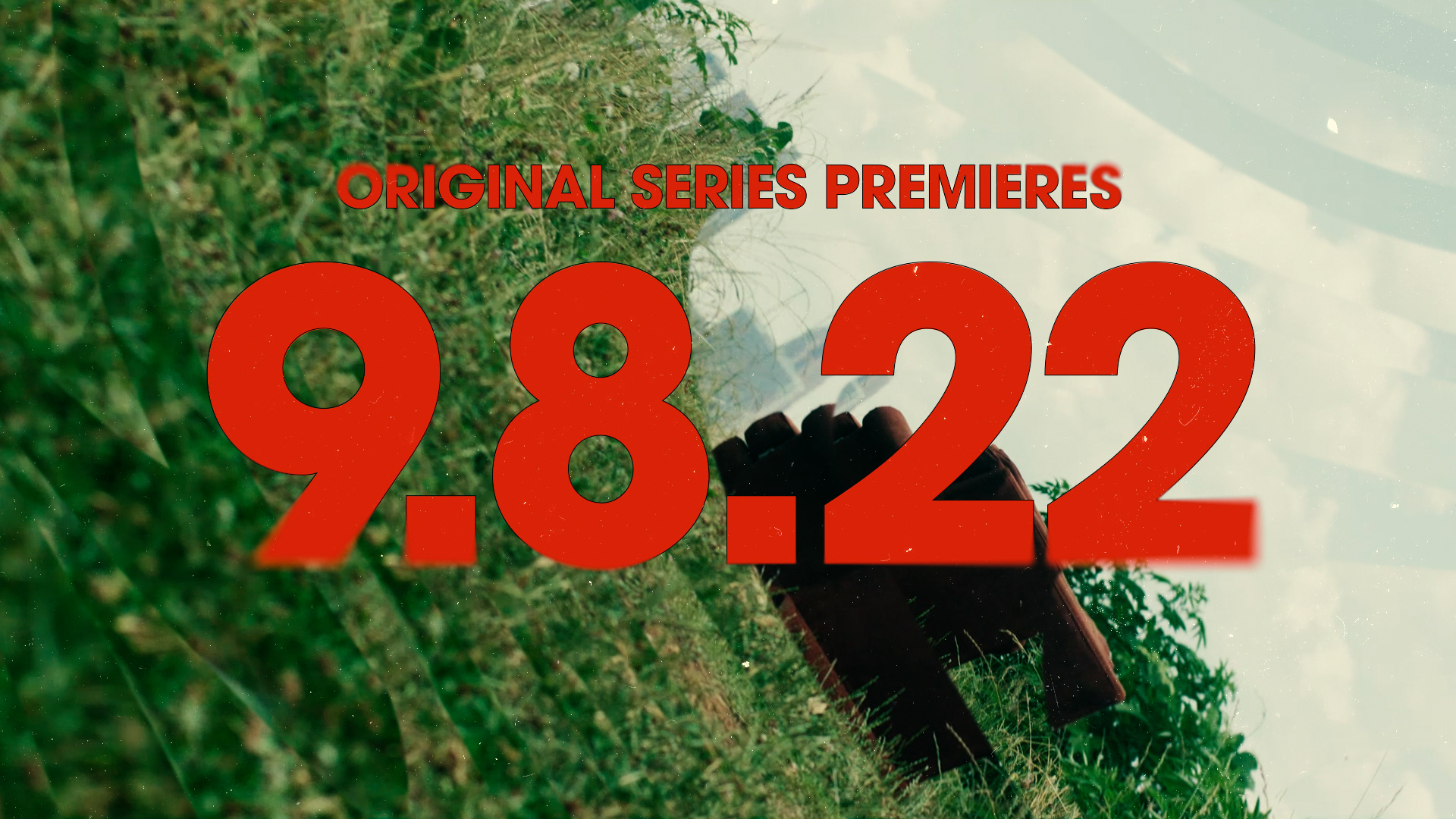
For the Trippy Red direction, we designed a very graphical treatment that leans on back plates, edge to edge type, and simple design artifacts. The motif of abstract warping lines grounded the concept, and created the distinct type animation. The footage has been pushed both in the FX realm and through overall color treatment. The fact that we’ve been in a dream is subtly being told through the saturation levels, edge blurs, and design elements.
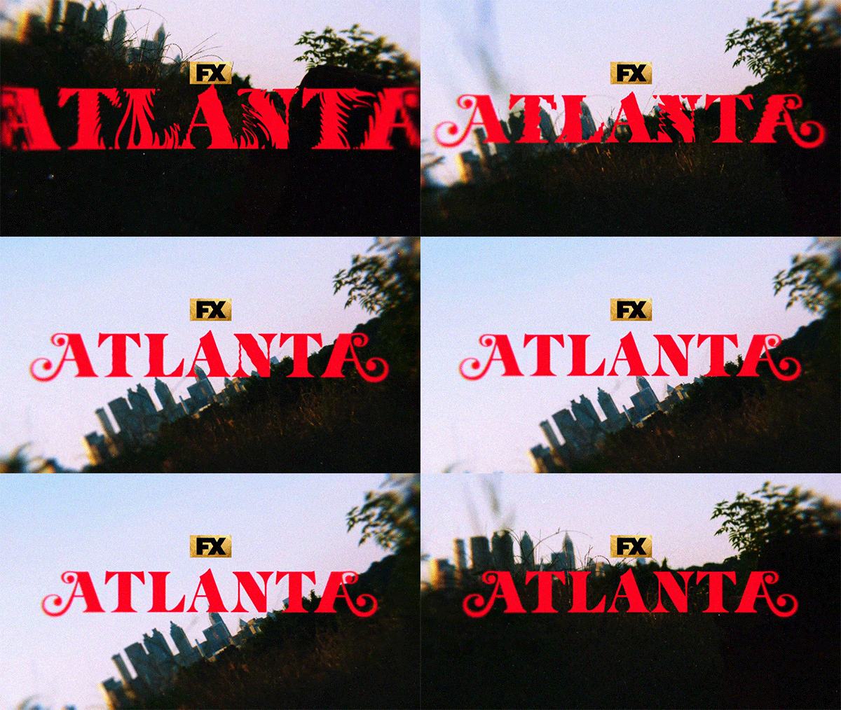
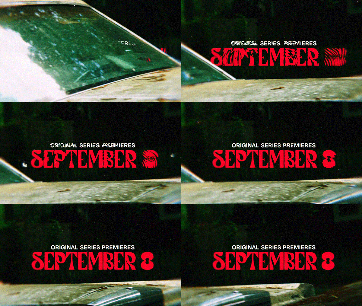
Initial Style Frames
Direction 3 - Warhol
–
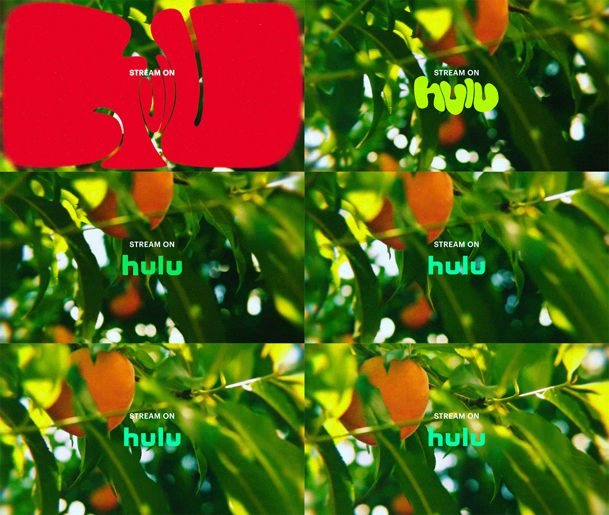
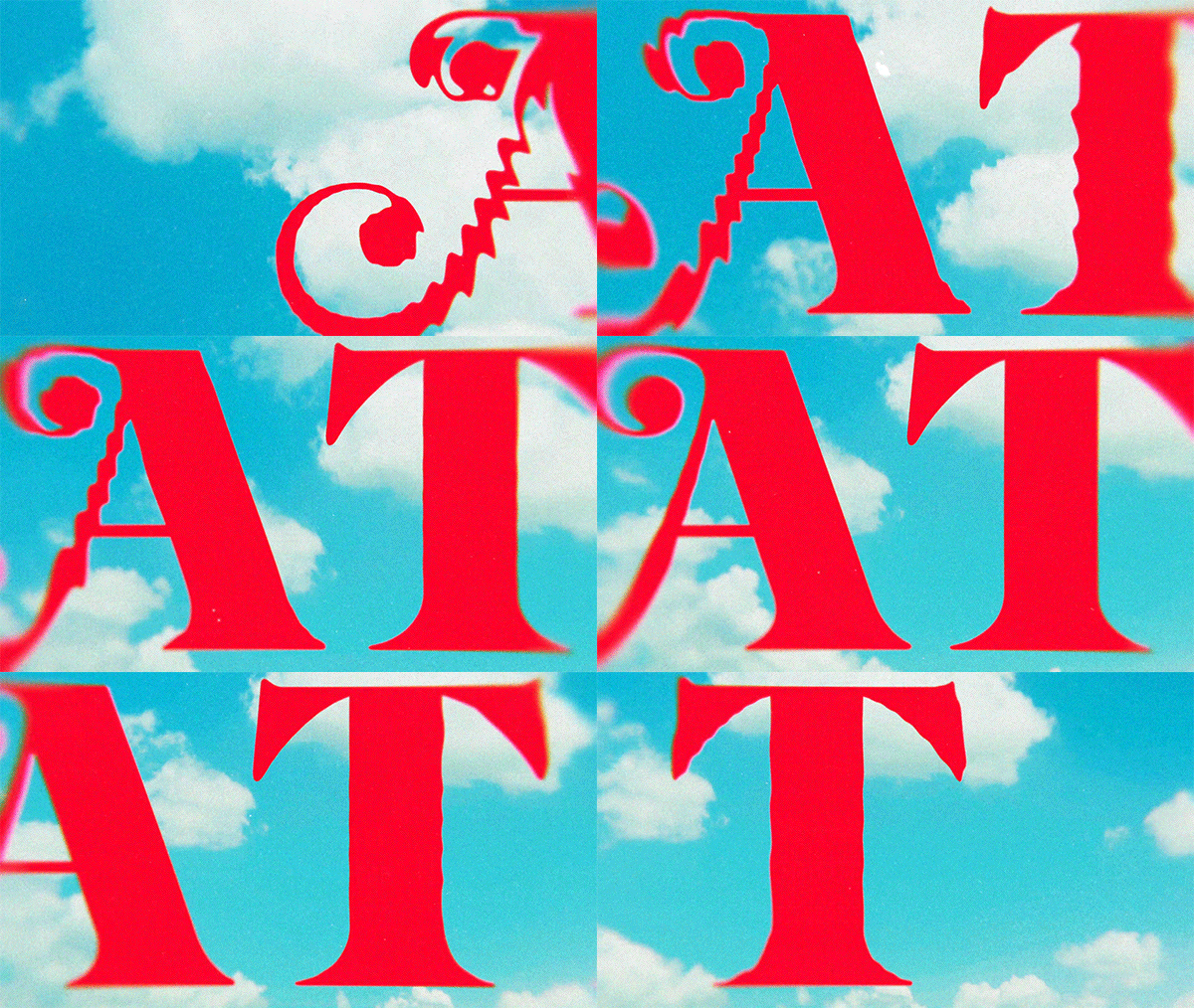
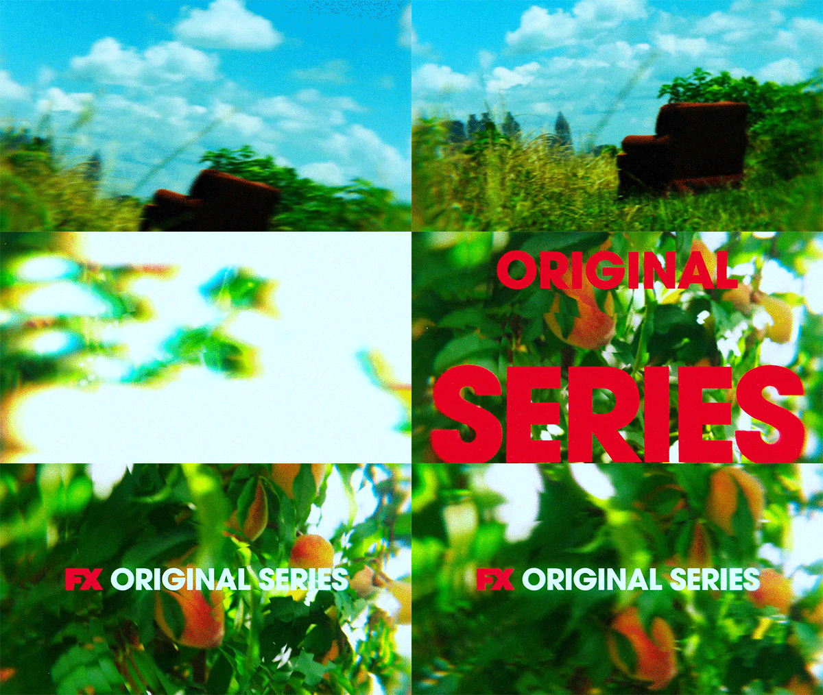
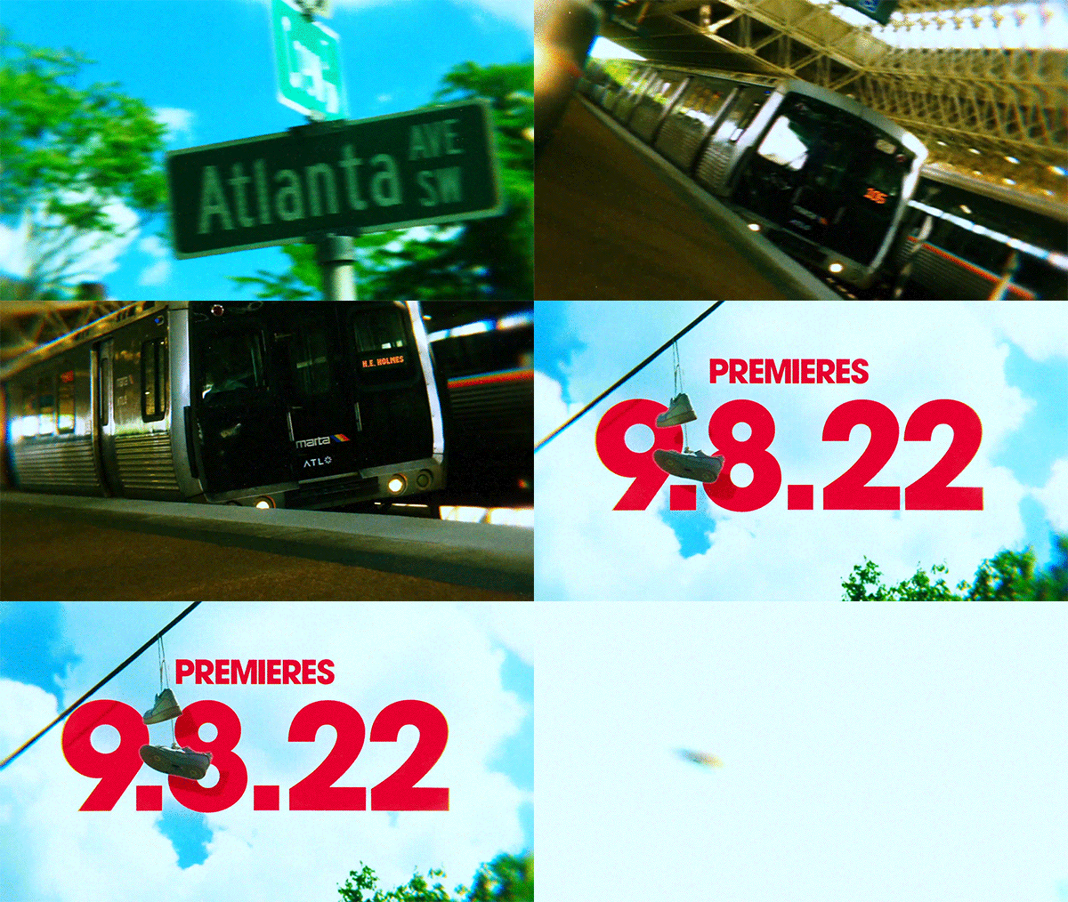
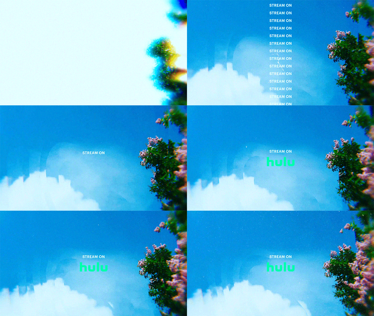
Warhol is what happens when high contrast and simplicity meet. The saturation of the footage–in conjunction with the bold red typography–provides a very ‘in your face’ moment that’s ultimately hard to look away from. The motion direction simply provides a dramatic, stark entrance, similar to how dreams tend to be preserved. The type subtly working with the environment will give us a lot of opportunities throughout the package.
Initial Style Frames

Thank You!
Credits:
Client: FX Networks
Creative Direction: Bran Moats
Motion Design / Editing: William Kesling
Producer: Josh Canter
Studio: Watson Design Group
